
![]()
Main

We take pride in how far we’ve come to create one of the most unique transmissions and premium automatic shifting systems in the market. We translate our story and culture into these guidelines to provide a voice and visual foundation for how to communicate our brand and products.
You will find our brand story, voice recommendations, and how to use visuals along with your work.
You will find our design principles, general rules, and tips for common visual design elements.

The road to premium automatic shifting
Bicycles have been around us for more than a century, enabling riders the freedom to do what they need or love the most: commute to work, visit friends, go on adventure. This form of mobility got better with each passing generation. In the 2000's, our foundational technology was also born — the Continuously Variable Planetary, a gearless variable transmission that used planets instead of belts or pulleys.

As long as there have been machines with wheels, inventors have sought ways to make them move more efficient. One such pursuit was the dream of seamless gear shifting—a way to transition smoothly between speeds without the clunky jumps of traditional gears. This vision gave rise to Continuously Variable Transmissions, an idea that dates as far back as Leonardo da Vinci, whose sketches from the 15th century hint at early concepts of CVTs. For a long period, CVTs were largely theoretical or experimental — until the 20th and 21st century, when engineers began developing them for real-world-use.


Our pillar technology, the Continuously Variable Planetary (CVP) was born in the early 2000s. It was invented by Donald C. Miller, in California, taking inspiration from the original CVT from five centuries before. It was based not on belts or pulleys, but on a set of rotating balls, held between input and output discs. It was commercialized by Fallbrook Technologies as NuVinci CVP (a “tip of the hat” to Leonardo da Vinci), and first saw its application in automotive, energy turbines, and bicycles — namely the Ellsworth 'The Ride' handcrafted bike.
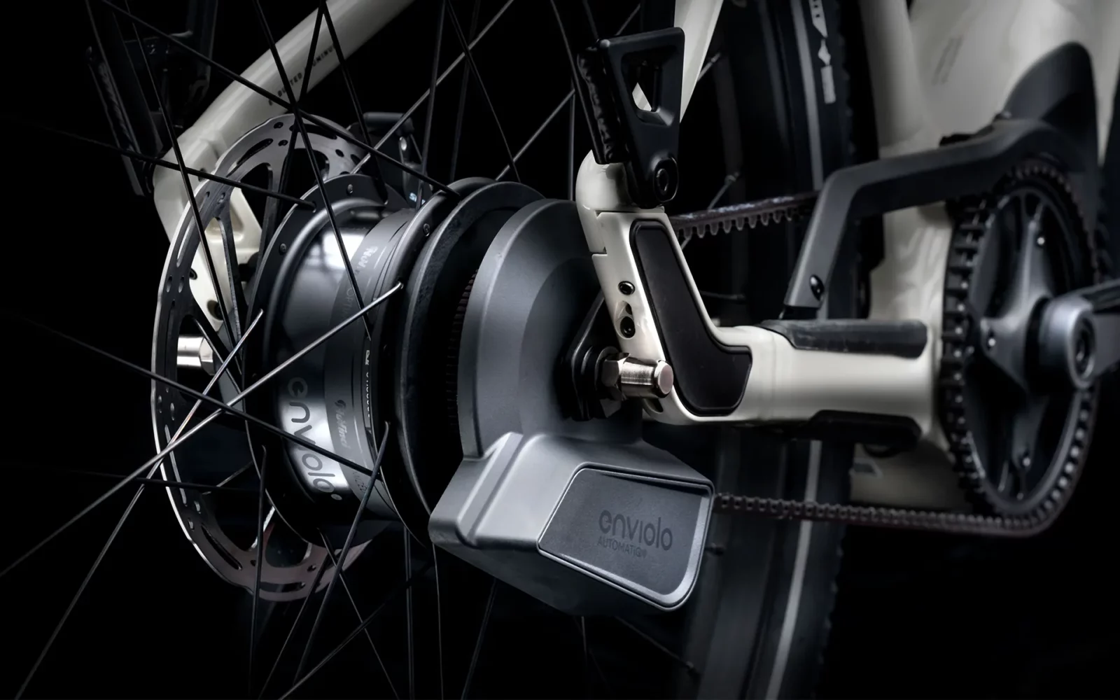
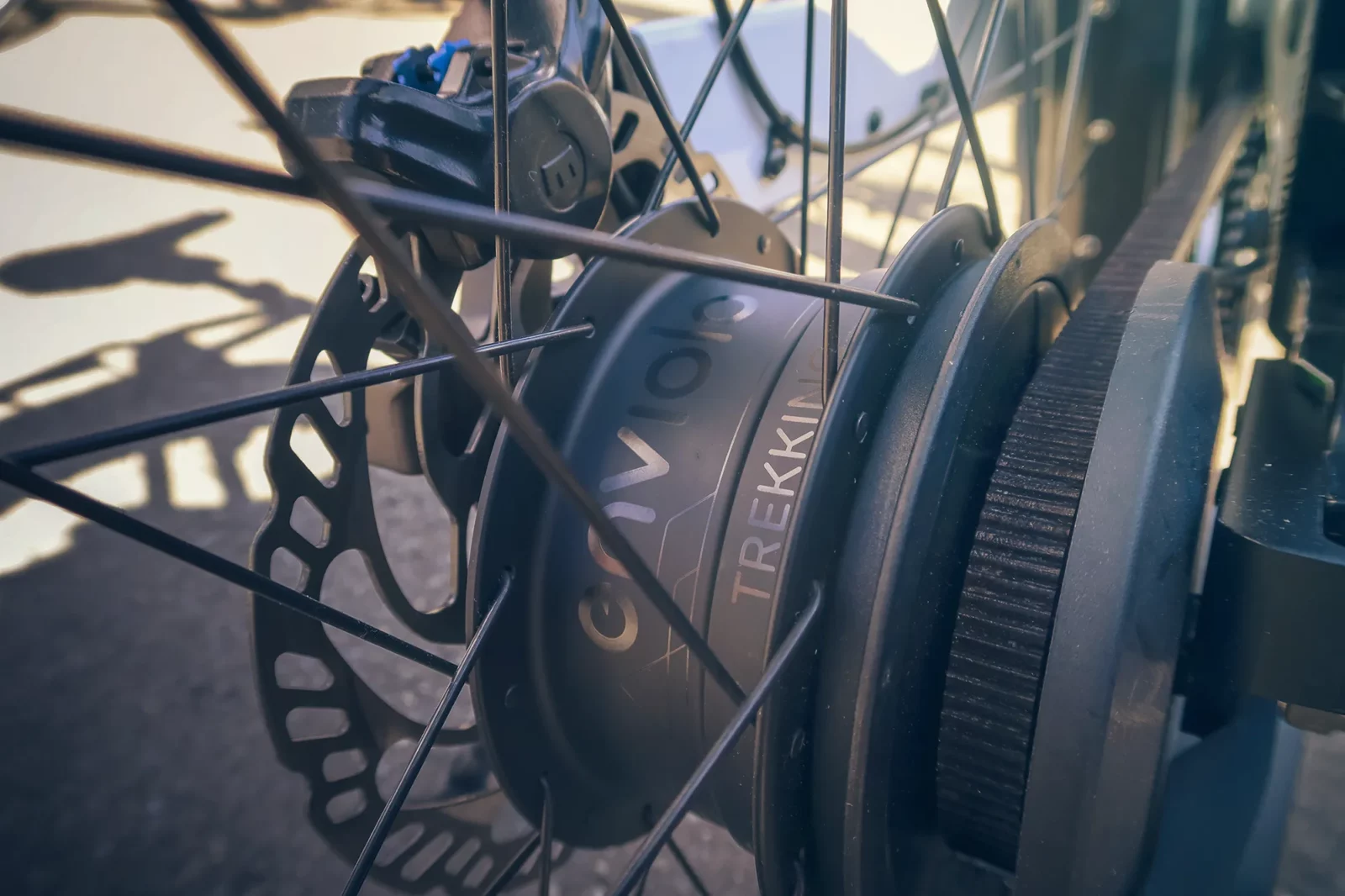
The CVP, combined with our automatic shifting technology, provides one of the most seamless, comfortable, and agile cycling experiences riders can try today. Yet, still to date, little rider awareness exists towards automatic shifting, including for commuting, trekking, and cargo e-bikes. We could do more to raise awareness of its benefits and convenience, but how?
The first CVP bike, and the first automatic
 In 2007, Fallbrook launched the NuVinci N170, the first CVP hub designed specifically for bicycles. It allowed for stepless shifting, meaning riders could dial in their cadence without thinking about gears or steps. Unlike traditional derailleur systems, the CVP could shift while stationary, under load, or without pedaling — an ideal solution for urban cyclists, cargo haulers, and e-bike commuters. Since 2007, the CVP and several bikes were recipients of multiple awards. Earlier awards included a 2007 R&D 100 Award, a 2007 Popular Science Best of What’s New, 2007 Technology of the Year and Bike of the Year in The Netherlands, and the iF Design EUROBIKE Gold 2008 Award.
Over the following years, Fallbrook released new, more compact and efficient models, and eventually an automatic shifting system as well. Between revolutionary innovation and trial and error, we have persisted in improving these products, perfected over several generations.
Never Shift Again is our call to increase rider focus towards automatic shifting. We break both the limits of manual shifting and traditional gears. We’re here to show riders just how great and freer their ride becomes, and the new experience and emotion it brings. Ride Enviolo Automatic and experience a ride beyond your imagination.
From enviolo to 'Never Shift Again'
In 2018, Fallbrook Technologies spun off its bicycle division and Enviolo is founded. Headquartered in Amsterdam, Enviolo is a new chapter with the mission to Move People Better solely via bicycles and e-bikes. With e-bikes becoming more popular in Europe and North America, rider expectations evolved, especially with electric assistance. Shifting needed to be more dynamic as riders moved faster, carried more, and encountered frequent stops. We realized, automatic shifting and e-bikes were a perfect match. The launch of the AUTOMATiQ in 2019 marked the third generation of our automatic shifting. This compact system integrates seamlessly with e-bike motors like Bosch, Bafang and more, adapting to terrain and rider behavior. Over-the-air updates ensured continuous improvement.

Enviolo’s automatic shifting system offers smooth, effortless rides. Boosting confidence, relieving stress, and enhancing focus and the sense of freedom of its riders. It’s available on bikes from well over 100 global bike brands. It makes e-bike cycling faster, more accessible and enjoyable. 'Never Shift Again' is our promise — not just a product, but a call to embrace automatic shifting as the future standard of e-bike commuting.

We’re a premium component, and our visual designs should reflect that. We take a lucid approach towards our visuals.
We also keep space to be inventive and playful. Geometric perfection does not deliver the best result — optical perfection does.
We’re a seamless product with a comfortable experience. We radiate this through our sunset palette and a writing that feels natural.
Our product delivers a great ride experience, expressed visually and verbally with confidence — not boasting nor hesitating.
For the logo to be visible, use a minimum of 10mm in print and 50px in screen.
Our logo should always sport lucid colors. Midnight Blue and White are the default. For black & white print, use Black and White. For certain creative situations, it can be stylized with other colors from our palette, but always review this with a design lead.
Light background
Midnight blue
Dark background
White
Grayscale
Black or white
Stylized color
E.g. Gradient vs pearl black
The Enviolo logo must be used consistently. Do not use it in the following ways:
Do not neglect contrast
Do not contain in a box
Do not manually grayscale
Do not drop a shadow
Do not angle
Do not stretch or shrink
Do not alter proportions
Do not change the type


Shifting has always been part of cycling. But with Enviolo Automatic, you ride smarter. What if you never had to shift at all? An automatic transmission so seamless, so intuitive, you almost forget that it’s there. It keeps you pedalling efficiently at all times.
At Enviolo, we fully believe in being an automatic-first brand. We call for a change in rider perception towards e-bike automatic shifting, raising the bar and leveraging our unique ability to deliver an obsessively smooth automatic.


In writing
✅ Capitalize every first word in paragraphs — 'Never Shift Again'.
✅ You may use upper case in headings — 'NEVER SHIFT AGAIN'.
❌ Do not write in sentence case — 'Never shift again'.
In visuals
✅ Design 'Never Shift Again' in uppercase.
✅ Design as big and and bold as the logo.
❌ Do not design 'Never Shift Again' bigger than the main logo.
❌ Do not use light or regular fonts for the tagline.


Move People Better remains our high-level motto, true to our core mission of delivering a better ride experience for cyclists of all kinds.
We are one of the many ingredient components in a bicycle, and we find our place in the ride experience by enabling our bike brand partners to deliver exceptional bikes.
We're relentless and do not stop until we get it right.
We are faithful to our people, relationships and commitments.
What we do, we do it with confidence. No BS, no exageration.
We choose every day and bring the best in ourselves.

In writing
✅ Capitalize every first word in paragraphs — 'Move People Better'.
✅ You may use upper case in headings — 'MOVE PEOPLE BETTER'.
❌ Do not write in sentence case — 'Move people better'.
❌ Do not use bold font.
In visuals
✅ Design in uppercase — 'MOVE PEOPLE BETTER'.
✅ Design with light or regular font.
❌ Do not design our motto more prominently than our logo.
❌ Do not use a bold font.

Enviolo’s voice should be a combination of both mottos in the previous chapter. It should strike a balance between confidently owning our value while recognizing our work as one of the many enablers of a better bicycle. Beyond that, we maximize brand-building cohesion with clear, comfortable, and concise language.
❌ Our proprietary drivetrain solution optimizes cadence across diverse user scenarios.
✅ Our automatic shifting system keeps your pedaling smooth at all times.
❌ Contact our service team to initiate your post-sale support process.
✅ Need help after your purchase? Our service team is here for you.
❌ Thank you for your latest transaction. We appreciate your purchase.
✅ Thanks for your order — we appreciate you riding with us!
❌ We regret any inconvenience this may have caused.
✅ Sorry about that — we know it’s frustrating, and we’re on it.
❌ enviolo AUTOMATIC shifts gears for you.
✅ Enviolo Automatic shifts gears for you.
❌ In order to provide you with the best possible performance, we’ve designed our system to automatically shift gears depending on your riding conditions.
✅ Our system shifts automatically and keeps your ride smooth.
❌ If you have any questions at all regarding the product or its features, please feel free to reach out to our support team.
✅ Got questions? Our support team is ready to help.
Write
Enviolo Automatic
Do not write
enviolo AUTOMATIC
Capitalize the first letter of every branded word:
✅ Enviolo Automatic
✅ Enviolo Trekking
❌ enviolo AUTOMATIC
If the sentence is in uppercase, the terms follow the same:
✅ NEVER SHIFT AGAIN WITH ENVIOLO AUTOMATIC
❌ NEVER SHIFT AGAIN WITH Enviolo Automatic
When referring to legacy brandings, capitalize Enviolo and the 'Q':
✅ Enviolo AutomatiQ
❌ enviolo AUTOMATiQ
Never write product names without the main brand:
✅ The Enviolo Automatic interface
❌ The Automatic interface

Aa Bb
The quick automatic e-bike cuts through the slow traffic jam.
The quick automatic e-bike cuts through the slow traffic jam.
Users typically zigzag through a page very fast, until they find a piece that interests them. They then start reading in more detail. This is why headings and structure are so important. And you know what? Search crawlers use this for search ranking as well.
Imagine this bit to be about bicycle technology, e-bikes as a great form of mobility, and automatic shifting as one of the greatest experiences ever. Are you picturing that? Great!
Now imagine our ideal trekker rider sitting at home in the kitchen. There's a big window, a few small plants, and it's early morning. The smell of coffee is in the air and this person takes a few sips from the mug. At the same time, scrolls through with the phone... not the healthiest habit maybe. But we don't judge. This rider also does not just read a page but scans through the internet at large - social media, email, news blogs, all sorts of attention grabbing!
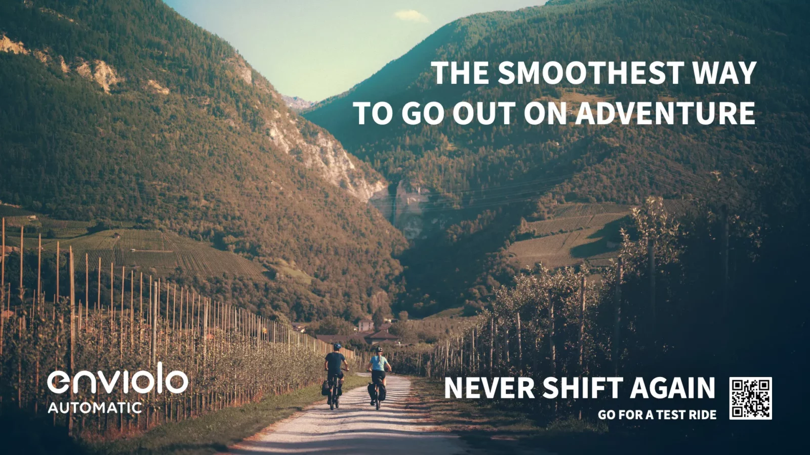
At some point there's an interesting headline and this rider slows down to read the details. It's about the automatic shifting experience. But who knows what the headline said? Maybe it said "Adventure awaits. No shifting required." ... Or "The smoothest way to go on adventure." One thing is for sure: users will scan quickly and read about what is interesting for them.
TITLE
Web
56px size. UPPERCASE.
Default in Bold.
Document
48pt size. UPPERCASE.
Default in Bold.
Space 34pt before, 3pt after.
Heading 1
Web
34px size. Sentence case or UPPERCASE.
Default in Regular or Bold.
Document
26pt size. UPPERCASE.
Default in Regular or Bold.
Space 36pt before, 6pt after.
Heading 2
Web
28px size. Sentence case or UPPERCASE.
Default in Regular. Light not allowed.
Document
22pt size. Sentence case or UPPERCASE.
Default in Regular. Light not allowed.
Space 24pt before, 6pt after.
Heading 3
Web
24px size. Sentence case.
Default in Regular. Light not allowed.
Document
18pt size. Sentence case or UPPERCASE.
Default in Regular. Light not allowed.
Space 16pt before, 6pt after.
Heading 4
Web
22px size. Sentence case.
Default in Regular. Light not allowed.
Document
14pt size. Sentence case or UPPERCASE.
Default in Regular. Light not allowed.
Space 14pt before, 6pt after.
Heading 5
Web
20px size. Sentence case.
Default in Bold. Light not allowed.
Document
12pt size. Sentence case or UPPERCASE.
Default in Bold. Light not allowed.
Space 10pt before, 6pt after.
Paragraph
Web
16px size. Sentence case.
Default in Regular. Light not allowed.
Line height at 160% or closest.
Document
12pt size. Sentence case.
Default in Regular. Light not allowed.
Space 6pt after. Line height at 1,15pt.
We're going bolder with our typography, with a few rules. In some specific cases, it may even be preferable to use a light font. Double check with a design lead when in doubt.
Use mostly when needing a heading to stand out. Typically in advertorials, main headings, and messages linked to our 'Never Shift Again' tagline.
Use as default for most situations, headings and body alike. Also for messages linked to our 'Move People Better' mission.
We use a font very specifically for products and select campaigns called Volte Rounded — a rounded font that evokes our CVP technology and smooth riding experience.


We continue the familiarity already established by our previous palette — a sunset. It brings warmth, comfort, and a smooth tonality, and we explore it in a crisper and more dramatic way.
These are the colors for most purposes.
Hex – #03161c
Rgb – 3, 22, 28
Cmyk - 98, 74, 59, 81
Pantone 7547 C
Hex – #020d12
Rgb – 2, 13, 18
Cmyk - 93, 76, 60, 88
Pantone Black 6 C
Hex – #ffffff
Rgb – 255, 255, 255
Cmyk - 0, 0, 0, 0
Paper / Ral 9010
Hex – #ed9b85
Rgb – 237, 155, 133
Cmyk – 4, 49, 44, 0
Pantone 486 C
Hex – #f5caa8
Rgb – 245, 202, 168
Cmyk – 3, 25, 36, 0
Pantone 474 C
Hex – #faeac0
Rgb – 250, 234, 192
Cmyk – 3, 8, 31, 0
Pantone 7506 C
For greater nuance, the expanded palette offers a wider range of colors and styling options.
For text, colored details, and gradients.
Hex – #ed9b85
Rgb – 237, 155, 133
Cmyk – 4, 49, 44, 0
Pantone 486 C
Hex – #f0ab91
Rgb – 240, 171, 145
Cmyk - 3, 41, 41, 0
Hex – #f2bb9d
Rgb – 242, 187, 157
Cmyk - 4, 33, 39, 0
Hex – #f5caa8
Rgb – 245, 202, 168
Cmyk – 3, 25, 36, 0
Pantone 474 C
Hex – #f7dab4
Rgb – 247, 218, 180
Cmyk - 3, 17, 34, 0
Hex – #faeac0
Rgb – 250, 234, 192
Cmyk – 3, 8, 31, 0
Pantone 7506 C
Correct use of neutral colors for text on light backgrounds.
Hex – #03161c
Rgb – 3, 22, 28
Cmyk - 98, 74, 59, 81
Pantone 7547 C
Hex – #45393f
Rgb – 69, 57, 63
Cmyk – 63, 65, 50, 57
Pantone 439 C
Hex – #9f9799
Rgb – 159, 151, 153
Cmyk – 38, 35, 31, 11
Pantone 407 C
Hex – #f8f5f3
Rgb – 248, 245, 243
Cmyk - 3, 4, 5, 0
Paper / Ral 9010
Hex – #ffffff
Rgb – 255, 255, 255
Cmyk - 0, 0, 0, 0
Paper / Ral 9003
Correct use of neutral colors in dark backgrounds.
Hex – #ffffff
Rgb – 255, 255, 255
Cmyk - 0, 0, 0, 0
Paper / Ral 9010
Hex – #cec0aa
Rgb – 206, 192, 170
Cmyk – 21, 22, 33, 3
Pantone 7534 C
Hex – #9f9799
Rgb – 159, 151, 153
Cmyk – 38, 35, 31, 11
Pantone 407 C
Hex – #03161c
Rgb – 3, 22, 28
Cmyk – 98, 74, 59, 81
Pantone 7547 C
Hex – #020d12
Rgb – 2, 13, 18
Cmyk - 93, 76, 60, 88
Pantone Black 6 C
For rich and colorful backgrounds.
SVG image
SVG image
SVG image
SVG image
SVG image
SVG image
For call-outs and context in interfaces.
Use the success callout for confirmations and positive results.
Accent
Hex – #52c999
Rgb – 82, 201, 153
Subtle
Hex – #52c9991a
Rgb – 82, 201, 153, 0.1
Use the useful callout color for recommendations and tips.
Accent
Hex – #49bfcf
Rgb – 73, 191, 207
Subtle
Hex – #49bfcf1a
Rgb – 73, 191, 207, 0.1
Use the wrong callout color for negation, wrong input, or alarm.
Accent
Hex – #f68f7a
Rgb – 246, 143, 122
Subtle
Hex – #f68f7a1a
Rgb – 246, 143, 122, 0.1
Use caution callout color to point out danger or potential hazards.
Accent
Hex – #f9b696
Rgb – 245, 202, 168
Subtle
Hex – #f9b6961f
Rgb – 245, 202, 168, 0.12
Use the neutral color for neutral tips and info.
Accent
Hex – #9f9799
Rgb – 159, 151, 153
Subtle
Hex – #9f97991a
Rgb – 159, 151, 153, 0.1
Use the success callout for confirmations and positive results.
Accent
Hex – #52c999
Rgb – 82, 201, 153
Subtle
Hex – #52c9991a
Rgb – 82, 201, 153, 0.1
Use the useful callout color for recommendations and tips.
Accent
Hex – #49bfcf
Rgb – 73, 191, 207
Subtle
Hex – #49bfcf1a
Rgb – 73, 191, 207, 0.1
Use the wrong callout color for negation, wrong input, or alarm.
Accent
Hex – #f68f7a
Rgb – 246, 143, 122
Subtle
Hex – #f68f7a1a
Rgb – 246, 143, 122, 0.1
Use caution callout color to point out danger or potential hazards.
Accent
Hex – #facaa3
Rgb – 250, 202, 163
Subtle
Hex – #facaa31f
Rgb – 250, 202, 163, 0.12
Use the neutral color for neutral tips and info.
Accent
Hex – #9f9799
Rgb – 159, 151, 153
Subtle
Hex – #9f97991a
Rgb – 159, 151, 153, 0.1